So, I went to grad school hoping to be a part of a visual effects industry that isn't falling apart. My hopes have not been deterred entirely... but have changed route. I feel as though I just lost interest in pursuing a career in an industry whose economic model is imploding. I think that working for a large animation house / studio might not be the best fit for me. First of all, contract jobs are by no means stable. The studio uses you for a year or two, and then drops you because they need to create another movie. It is no secret that the VFX industry isn't doing well. Dreamworks will lay off between 350 - 500 people this year (the number of people varies depending on the source) and Rhythm & Hues went bankrupt. Also, jobs that require brainless repetition doing one very very specialized task that could take a year or MORE have turned me off. Check out Cracked's 5 Miserable VFX Jobs that Make Movies Possible. Steven Spielberg and George Lucas recognize the change in dynamics in the film industry with this advent of computer-generated technology and the changing economy and predict a massive overhaul/implosion in the film industry. Although I don't know if the situation is going to change this drastically, I think that there are some changes happening. I am hesitant to jump on the massive VFX slaveship, although I do enjoy compositing, texturing/shading, and digital lighting.
I love the idea of making films, but the industry model doesn't seem very lucrative or offer stability... and it is very cut-throat for women (not that I am afraid lol). It's just not fully receptive to women yet, regardless of how assertive I am. I would like to work in an environment where I can try a lot of new technologies all the time. With a background in graphic design, and a newfound interest for animation and motion graphics (the past couple years I have been doing some for school and working in my spare time at the Ohio State Athletic Department - The Buckeyes, making scoreboard animations for football, basketball, hockey, volleyball, etc.), I would love to do some motion graphics for a smaller firm or maybe a software company. The infinite possibility of a visual story or visual narrative is wonderful, and I can combine graphic elements with some animated elements, creating a richer, deeper, more interesting time-based project than just something that is a flat work of art. I love films, and will always, but I like creating art first and foremost. I think art can tell a story without having to be 2 hours long and require 500+ people for production. |
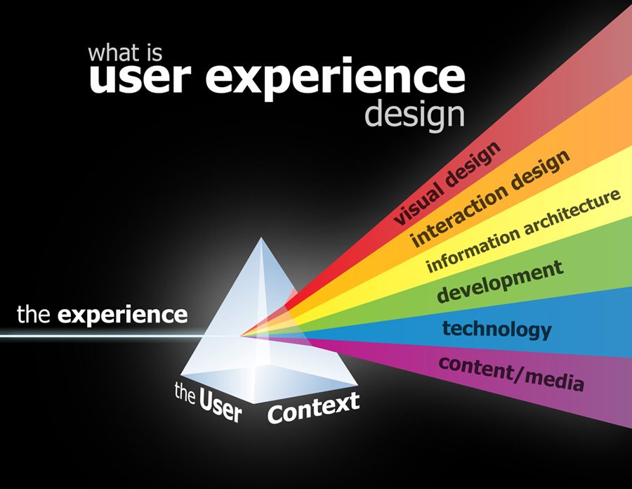
I also love the idea of working for a software company doing the front-end design for software or for web/mobile. The need for User Experience and User Interface Design is ever-increasing. And it is something I have really grown to enjoy. I worked the past two years creating a project for women in the military here at Ohio State. It involves very structured design work, research, information architecture, visualizing, testing, a little web programming, all of which I find rewarding as they are challenging for me. Producing a workable, usable, interactive product that actually serves a purpose for the intended audience speaks to me more than something that is simply a work of art to be looked at. The logic involved is a little bit more involved than just the visual/spatial logic you use to create a 2D work of art also. So it is a challenge for me... one with rewarding outcomes.
In the next year or so, after I finish my thesis short film, I will be at a crossroads of sorts. So you see, I have been thinking a lot about where I want to be and have narrowed it down quite a bit considering the vast array of work I have tried in the past. I think these two career paths are the directions I could take in my proverbial design career "fork in the road." In the meantime, I will work on my thesis film and paper as well as be teaching courses this fall and spring. I still have considerable time before I seek a job (a year), but in the meantime the state of the VFX industry, the industry where I am currently pursuing my master's, and the niches I have chosen in the design field will be subjects I will forever keep in the back of my mind :). |
Monday, June 17, 2013
Career moves... In this industry, you have to be strategic
Sunday, April 28, 2013
What Does Reality Mean to You?
What does Reality Mean to You? is a short piece that I created as a precursor to my thesis. In this piece, I use various styles of graphics in 2 dimensions and 3 dimensions to showcase answers to the survey question “What Does Reality Mean to You?” For this animation, I collected 25 anonymous participants’ written responses to a six-question survey I created and distributed online. I wrote about it in my planning stages in a prior post: Project II Proposal - What Does Reality Mean to You?
|
When I create my thesis film, I would like to include more opinions about reality, reality as it pertains to current films and changing expectations and general perceptions of reality. This is important because graphics have improved so much nowadays that films can create alternative forms of believable reality, and enhanced realities or "hyperrealities," possibly changing viewers perceptions on what reality means and what technologies can do for us.
I decided to use a modeling style that was simple, low-poly, and geometric, which is similar to the modeling style in a video I liked on Vimeo called “Let’s Talk About Soil.” This modeling style allowed me to create simple forms and to keep the project achievable given our time frame of half of a semester to complete the work. As a takeaway, I would like the viewer to know that reality is a subject with no agreed-upon definition by philosophers and social theorists. The only thing that is agreed-upon is that reality is perceived. This video was meant to assert that every person perceives reality differently. I really enjoyed working on this project. Thanks to all my voice actors and survey participants! It would have not been possible without the amazing ideas of the survey-takers and my colleagues at ACCAD, who despite their disdain for hearing their own voices, sound lovely! |
Friday, April 26, 2013
Oz the Mediocre and Not-Really that Powerful
A couple of weeks ago, I went to see Oz the Great and Powerful. It might have been a great movie for children, because as a Disney film it was visually brilliant. It was, however, hard to pay attention to the movie. It was long, drawn out - the story became lifeless and lackluster. The protagonist (Oz, played by James Franco) was not reliable as an identifiable, honest character who grows throughout the story. He was sometimes nice, sometimes not - he seemed like a player who just womanized in the beginning and then didn't really care about Oz until the end when he tried to save it with his parlor tricks. Mila Kunis was over-dramatic and I think better suited for comedy roles. Her costume makeup was awful, (I know she is supposed to be the hideous Wicked Witch) but they could have updated the look for this movie - it looked like cheap green Halloween makeup with prosthetic chin and cheeks. Some of the animation in the set was cool... the jewel-like foliage was interesting. I might have liked the jewel-like foliage because I like shiny things. | Whatever the case, I think the visual effects and style of the film was its strong point, but the overall plot was terrible. I think the movie could have been shortened and the script could have been funnier as well as written to appeal to an older audience in addition to the usual family-friendly crowd. The overblown talk of fairy tales and greatness of the land of Oz was just terribly uninteresting. This movie has no soul, a story with no real development. I think this speaks to the fact that Hollywood can deliver us a beautiful film, but if the story is blasé, the movie is too. Story is king and in this case the story failed to deliver. Lovely set design and animation - I am not going to knock Disney for trying. |
Monday, April 1, 2013
Jessica Hische: Should I work for Free?
Kindness: The only thing thing that should be free when it comes to creative work
Several years ago, I went to a Design Madison event at Hiebing. Jessica Hische was the guest speaker. She is engaging and quirky, and has a wonderful sense of humor. She is also AMAZING at type design. AND, she can make a mean web site and has an established web presence. I have been furiously revamping my portfolio web site because I have been searching for summer internships (Check it out at Biesboerdesigns.com). I know it is not perfect, but I had to get some of my works out there in a more appealing way than with my old Flash layout (flash, as we know is a dying technology). I used some great free tools such as highslide.js because I am not so keen on javascript, and a simple semi-responsive layout built to fit on screens of all sides (perfect fluid width layout). | Anyway, during my search for internships, I recently re-encountered Jessica's Should I work for free? chart because I had been noticing again all the companies that host unpaid internships. Jessica is so wise! And intelligent! I think that it's blasphemous that designers and creatives have to put up with this in our field. I completed an unpaid internship in one of the most expensive cities in the United States (New York City) when I was 21 soon after the collapse on Wall Street and I don't think I would work for free for that length of time again. I hold a bachelor's degree and designers and artists have also paid lots of money to complete school in addition to the rest of the world, so I think that just because work is creative does not mean it should be unpaid. It is also work and requires skills and hours and hours of work. I am not wrong to say this or being egocentric about my work. People in the design field are required to have years of experience just like everyone else. We need the basic means to sustain ourselves such as food, water, and shelter. I am in the process of completing a master's degree, and I think that to work for free at this point would be to devalue my work. I think the bottom line is: if you value your work, you should NOT work for free. Thanks for the cute chart Jessica! Her piece is also available as a fancy letterpress print here |
Digi-EYE
On Friday I went to a festival compilation of digital film works by undergraduate film studies students at OSU, with several DAIM (graduate digital animation students) pieces thrown in. I was blown away by the films by the undergrads - their pieces were amazing. I loved the humor in the pieces, and the compositions they have created. I thought they all paid really great attention to sound as well. I recognize some of the students from a film studies class I took as well. I loved the music and the beat of Cotter's piece All Your Light (Times Like These). I also loved that everyone LOLed at Renee's Buried Unicorn. I think her film is universally identifiable because tuition debt is something that can weigh on a person and kill their spirit. I also loved Seth Radley's Cinemagraphs: An Experiment. I thought it was very creative. All of Tom Heban's pieces (Heblog) were great, although I have seen most of them before as he is a fellow graduate student in our department. Katherine Stevenson's Good Deeds was absolutely hilarious. I also really liked David Goodwin's pieces, Absence and Interstice as they were serious and reflective. | I was, however, disappointed with the politics involved with this exhibition. I think that the DAIM students' works were thrown in last minute. I was a little disappointed considering my pieces were thrown out of the lineup, even though my name and picture were present in the title sequence for the event. This is fine, but some of the animated works that were REALLY GREAT were also left out, like Sheri's piece. I also thought that Janet Parrott threw her work in to the mix with Ordinal 5, which was a little out of place considering it was a students' film festival. I thought her piece, about dance and the number 5, could be improved. The math didn't line up to what the dancers were doing (there were 7 dancers?). That piece was long and drawn out compared to the students work. The students utilized things like suspense, dialog, composition, tempo and all sorts of other devices to get the viewer engaged. Her piece, did not engage at all. It was academic-sounding and not engaging. There was no hook, no climax. The dancers were wearing weird leotards and were kind of creepy - they looked like extremely tight black and white spandex parachutes. I also thought it was discourteous that her piece was 8 minutes long, the longest film in the festival, whereas one of the works I submitted were ten seconds long. I think that some more digital animators pieces could have been used in the showcase instead of hers, like Sheri's Cinderella piece. Also, Ann Sofie Clemmensen's work The Laws of Jante utilized dance just like Ordinal 5 and was engaging. She utilized timing, repetition, intertitles and an old-timey black and white silent film style that worked with her subjects. Overall it was a great event, I just think that parts of it were pieced together last minute and that the DAIM submissions were widely underrepresented. |
Monday, March 25, 2013
Guest Speaker: Teri Rueb
On Friday, ACCAD hosted a very special guest speaker, Teri Rueb (terirueb.net). So I thought I would write a little about her, her work, and what I learned from her presentation. It is not everyday you encounter a scholar with a PhD from Harvard!
BIO
Teri Rueb is an artist whose work engages digital, architectural and traditional media and modes of production. Her most recent project, “Elsewhere : Anderswo” is currently on exhibit across two sites in Northern Germany, The Edith Russ Site for Media Art (Oldenburg) and the Springhornhof Kunstverein (Neuenkirchen). Another recent project "Core Sample", received a 2008 Prix Ars Electronica Award of Distinction in the Digital Musics category. Rueb has pioneered the form of GPS-based interactive installations and is the recipient of numerous grants and commissions from international institutions including the Edith Russ Site for New Media, The Banff Center for the Arts, the Boston ICA, Artslink, Turbulence.org, and various State Arts Councils. She has lectured and presented her work worldwide at venues including Ars Electronica, ISEA, SIGGRAPH, Transmediale, The New Museum of Contemporary Art, Kiasma Museum, and IRCAM. She recently completed her doctoral degree at the Harvard University Graduate School of Design where her research addressed constructions of landscape and subjectivity in mobile network culture. Rueb is Professor of Media Study at the Department of Media Study, University at Buffalo (State University of New York). She also mentioned she did her undergrad at Carnegie Mellon and earned her Master's from New York University. She served as Associate Professor (with tenure) and Department Head of the graduate Department of Digital + Media at the Rhode Island School of Design (RISD) where she was one of two founding faculty members of the department from 2004-2009. WHAT I GATHERED FROM HER WORK AND PRESENTATION
Teri Rueb's work is concerned with cartography and spacial representation. Her work begins with an invitation to explore; she does this with sound overlay. Her experiences come into being through sound in her projects. She also spoke about how places have agency, and her work is concerned with discovering this agency. She is interested in the aesthetic and the kinesthetic qualities of GPS in site specific work. Her 2004 piece, Drift allows people to walk along tidal flats in Northern Germany (the Watten Sea). When tides are low, the area can be explored and sounds play in response to the explorer's movements - sounds are nested in areas of concentric circles. Viewers of her project carry a custom P.C. device, with java code that plays the sounds. She noted that the process of creating this project included lots of walking and programming, as well as adjusting things by small increments. She is influenced and sensitized to Cartesian maps and specific qualities of the landscape, fed into the perception of space. She was trained traditionally as a sculptor and painter, and went back and thought about landscape as something you produce. Richard Serra and Robert Smithson are some of her artist influences. She spoke about how sound, site and movements of the body become part of her work. She also is influenced by feminist Elizabeth Grosz. Grosz stated that the meaning of geography is cartographic, and based on specific coordinates, while the meaning of landscape is perceived and experiential. This is very apparent in the works she presented. CORE is a piece located on Spectacle Island, near Boston. This island was originally a landfill, and conservation efforts have more recently converted the island into a park. As viewers traverse to different topographic levels/heights on the island, the sound the viewers hear changes from sea level to the atmosphere, or the highest topographic level of the island. The audio consists of ambient sounds and spoken word, organic and inorganic sounds, as well as sounds of the past, present and future. In congruence with this piece, a soil sample or core sample of the island was on display at the Boston ICA Gallery. This is a sound sculpture and the different sounds play as viewers walk by each level of core sample. The two sites exist dialogically. |
Elswhere : Anderswo was created during a residency in Oldenburg park. Its central themes revolve around the alienation we feel when we travel. She juxtaposes the German landscape with sounds that derive culturally from the West (In her video, I heard sounds from the movie soundrack from Willy Wonka and the Chocolate Factory as well as sounds and melodies from Western music). Unlike CORE, she did not take into account the history of the site in this piece, but rather the juxtaposition was the focus to communicate the feeling of alienation. No places with names, 2012 is a site-specific work located in Española near Santa Fe, NM dealing with the concept of wilderness and the re-appropriation of place and wilderness. Specifically, viewers at the Institute of American Indian Arts can traverse the landscape outside and hear sounds; some are spoken interviews of native Navajo and other tribe members who speak of the Long Walk and other cultural aspects of Navajo history and life. The Long Walk was essentially a seldom-mentioned genocide that occurred in the 1860s during colonization of North America. The Navajo were forced off of their land and it decimated their sheep, crops and their overall population, and the site of the Institute of American Indian Arts is now built along the same path of the Long Walk. This project illuminated the fact that the wilderness/landscape is not devoid of rich cultural history just because there are no markers for it on a map. In actuality there is a dialog that is seldom heard, and this project illuminates the voices of the Navajo where a cultural and geographical re-appropriation has existed (She points this out by showing the map of the Española valley with names in Spanish, Tewa, and English). During the question and answer period, Teri talked about how with the advent of new technology, she has less control over her hardware and no longer loans out computers/GPS devices for her works. She wrote an application for her works that can be accessed on cell phones and smartphones. This doesn't always work to her advantage because her goal is to suspend viewers of her work in a focused experience, and people get distracted by their phones such as phone calls, notifcations, etc. People also use their own earbuds, which doesn't always get the greatest sound quality. The advantages of using an application however, makes her work free and accessible. For her next possible project, Teri spoke about how she might work with sound more interactively; perhaps by having people walk around in a space and playing with how their proximity to one another affects the sounds they are hearing. Overall it was an interesting presentation, as her design work is a little different from those I have seen. Her work is very academic and seems to stand at a higher intellectual level than most - I appreciated that. However, at times, it was a little difficult to understand quite what she meant in her presentation. Although my work follows along a different vein, it was wonderful to hear from a designer with a very different viewpoint and different methods on approaching her work and process of creation. |
Sunday, March 17, 2013
Max Hattler - Experimental Animation Done Right
"I am interested in the space between abstraction and figuration, where storytelling is freed from the constraints of traditional narrative. While my films tend to be without dialogue, they explore the relationship between sound, music and the moving image." —Max Hattler I am going to post a little about one of my favorite video artists/ experimental animators, Max Hattler, as he is one of my influences. Max Hattler is an experimental animator and moving image artist based in London and Germany. Many of his pieces create relationships with artifacts of the past and present, or the relationship between form and living beings. Max Hattler performs live audiovisual works at festivals, in art spaces, and sometimes in clubs. Max Hattler was educated in London at Goldsmiths and the Royal College of Art. He has had solo exhibitions at Tenderpixel Gallery, Playgrounds Festival, Lumen Eclipse, Media Art Friesland, and Someonesgarden Tokyo, and retrospectives at Go Short Nijmegen, Image Forum Festival, Fredrikstad Animation Festival, Lago Film Fest, Branchage Film Festival and International Short Film Festival Detmold, among others. His works have been shown at hundreds of film festivals as well as in museums and galleries such as Erarta Museum, MOCA Taipei, the Marl Video Art Award, Yota Space and Gasworks Gallery. Awards include Multivision Festival, St. Louis Film Festival, Premio Simona Gesmundo, Visual Music Award, Animate OPEN Digitalis, London International Animation Festival, Videofestival Bochum, Videologia and many more. Hattler's films have been included in the touring programmes of Videoformes, Videoholica, onedotzero, the European Media Art Festival, Euroshorts, Shorts Attack, Fairecourt, 700IS, The Animation Show, L'Alternativa, Animac, AURORA, and the British Animation Awards. Max collaborates with other visual artists like Noriko Okaku, Robert Seidel, Motorsaw, i.m.klif and Protey Temen. Max also creates concert visuals or works live with sound artists and music acts as diverse as Basement Jaxx, Diplo, Jovanotti, Ladyscraper, The Egg, Kraan, Ocusonic, Mikhail Karikis, Dollskabeat, Fried Dähn, Mehmet Can Özer, Pablo Gav, Hellmut Hattler, and Vesper On. Let me add that I love Diplo. Awesome beatz. He has presented his audiovisual live performances around the world, including the Museum of Image and Sound in Sao Paulo, Electrovisiones Mexico City, the European Media Art Festival, Cimatics Festival, Donaufestival Krems, Filmfest Dresden, SuperDeluxe Tokyo, The Big Chill Festival and London's Institute of Contemporary Arts. He teaches in London at Goldsmiths and the University of the Arts, Chelsea, and is studying towards a Doctorate in Fine Art at the University of East London. Max Hattler has also been on movie projects such as 28 Weeks Later working as a digital compositing artist. For more, see www.maxhattler.com |
Max Hattler creates his work using a variety of techniques and methods, depending on the project. He creates works that are stop-motion such as AANAATT, 2008, and also works with 3D and 2D graphics programs. He also has experimented with hand-created animation as well. The images are usually projected either in a gallery as a loop, museum, in a club or concert venue, or in one particular instance, X, projected onto mist at the Kings Cross Filling Station in London (2012). |
After watching several of his videos, it is apparent that he prefers to work with dark backgrounds and impossible objects and patterns made of bright, neon colors that briefly pass through the screen or loop quickly. In one of his most prominent pieces, 1923 a.k.a. Heaven is a loop based on the outsider artist Augustin Lesage’s painting A Symbolic Composition of the Spiritual World from 1923, and is one piece out of a series (the other loop is called 1925 a.k.a. Hell, based off of another one of Lesage’s paintings). The original piece created in 1923 is based on spirituality and the ornamental traditions of various cultures. This version also captures the sense of a spiritual virtual world, with the entrancing visuals and sound effects. | Neon patterns of light dance and seem to wrap around ancient architecture in a digital space. The manner in which the bright patterns that form and move on the surface of the 3D objects insinuate 3D architecture that is too dark to actually discern. On Max’s web site, a reviewer describes the piece as a “building that is a machine – a chapter of Tron occurring in Ancient Egypt.” The patterns that form are that of technology; symbols for stop, play, pause, circular dials. The forms change colors from a warmer color scheme to cooler, more analogous colors, and the camera movement occurs by zooming deeper into the complexity of the architecture. The beat of the music is simple drum beat, mixed with a more synthetic digital beat reminiscent of old video games. The depth the piece creates in virtual space is spectacular and this contemporary version of Lesage’s piece serves as an infinitely complex, technological homage to a very important but lesser known modern artist. |